Setting the stage
Picture it. You’re finally in that type of course that allows you to put whatever you want on your cheatsheet for the exam, no requirement to have handwritten it on your tablet or (god forbid) using a physical pen on a physical piece of paper, just free reign to type all of it up and copy-paste images to your heart’s content. As an engineering student, such a scenario appears rarely, but when it does, it is oh-so-sweet.
Except… when the opportunity does arise, it’s usually for a course where the lecture content rivals some textbooks in just the sheer amount of concepts covered (typically 1k+ slides over the course of a semester, with each slide as dense and filled to the brim with testable content as any other). Which leads to the question: what’s the best way of writing out everything you can reasonably put down on a single sheet of paper (double-sided, of course)?
The answer is surprisingly simple. But to get there, there’s 3 things we need to consider: the medium (how to write your cheatsheet), the message (what to write on it), and the machine (how to print it such that everything remains readable).
Oh, and if you’re looking to take a peek at what exactly we’re going to learn how to make, well, here’s an example in it’s full glory:
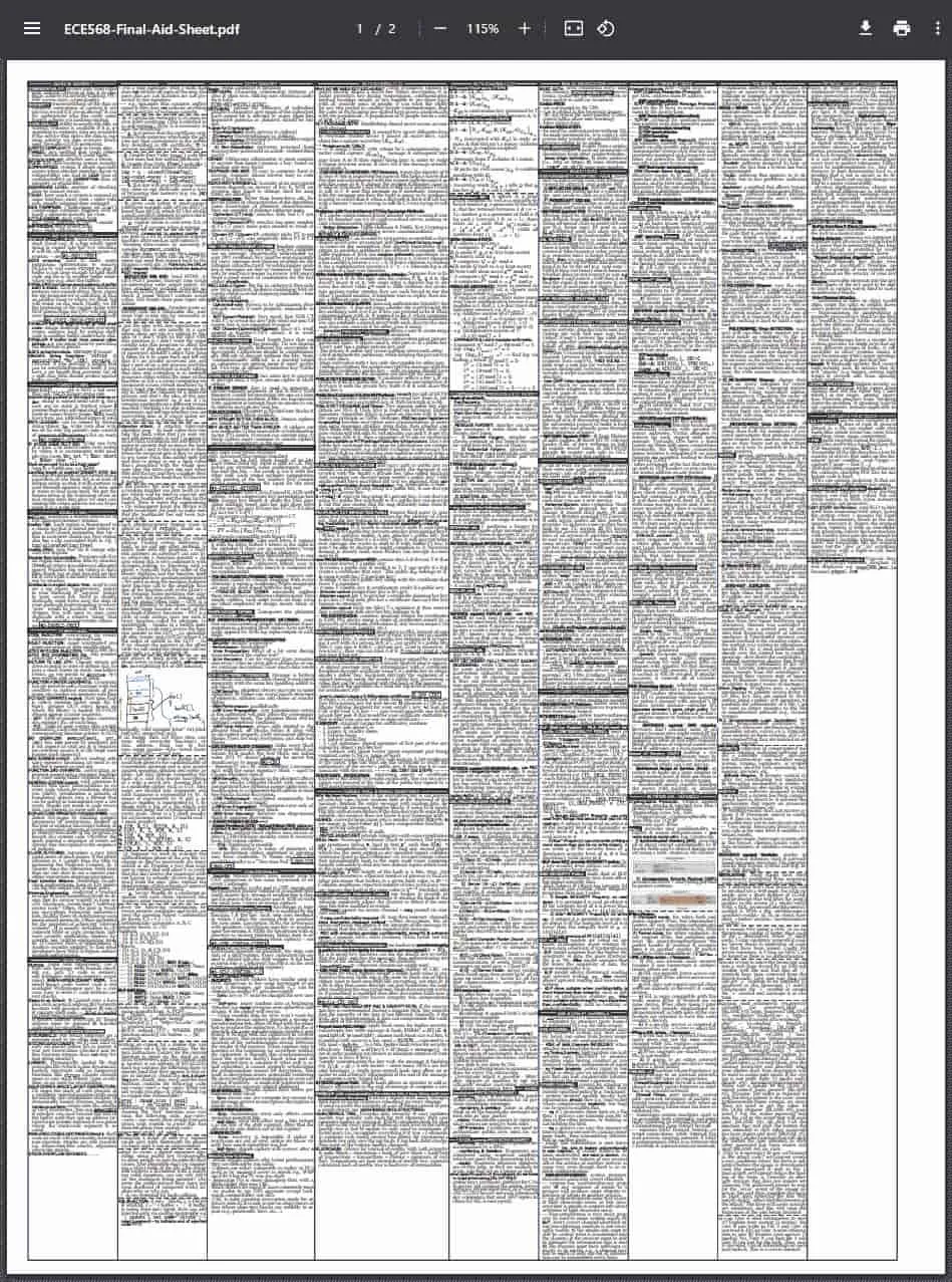
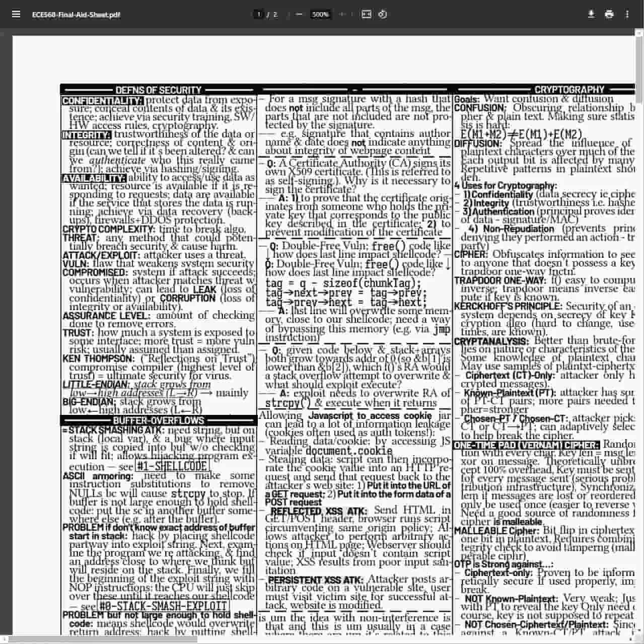
Alas, putting together a behemoth of a cheatsheet like this one takes a while. It’s an intricate process that involves making a number of decisions, the first of which is selecting the best tool for the job.
The Medium
Picking the tool of choice for writing your cheatsheet.
This really just boils down to picking one of two choices: taking a WYSIWYG editor approach (word processors the likes of Microsoft Word and Google Docs) or a programmatic approach using a typesetting engine (normally one would just use LaTeX, but the newcomer Typst engine shows a lot of promise and as we’ll see later on, is a hidden gem for making all the granular changes needed for a cheatsheet).
There are some third-party alternatives like Cribr and a handful of side projects posted on Github, but they lack the fine-grained customizability that is sorely needed for making your cheatsheet pixel-perfect (including setting fractional font sizes, word and line spacing, character kerning, and most notably image placement).
The cream of the crop is Typst, and here’s why you should be using it instead of some of the other options at your disposal.
Google Docs/Microsoft Word
I’ve successfully used Google Docs to make a slightly but not that dense cheatsheet for an operating systems course in the past (which, as any computer science or engineering student can tell you, has oodles of terminology and concepts that you need to remember), and while it was decent to some degree, it’s lacking in a lot of ways (almost all of which are remedied by Typst). Here’s just a few of why you shouldn’t be using Google Docs for your cheatsheet:
- It gets real slow when word count gets real high, especially in Google Docs.
- Zooming in/out to parse through really small text is a hassle, especially when it comes to finding specific words or phrases amongst an ocean of text.
- Making document-wide changes to text formatting (like changing the highlight colour of all bolded text) is at best a finnicky modification of document styles and at worst a completely manual endeavour involving lots of copy-pasting (and trust me, trying to use the format painter with paragraphs of teeny-tiny text without accidentally modifying anything you don’t want to modify is a lesson in pure frustration).
- It’s really hard to plan out how to organize content (tables would be the ideal way of grouping text together, if they weren’t so finicky to adjust), and moving content from one place to another requires so much reshuffling that it makes you question whether the whole thing is even worth it in the first place (and it is, just not if you’re doing in Google Docs).
- Adding, updating, and removing images is an exercise in frustration and a reminder of how true to life that one meme is (about Word spazzing out your delicately edited formatting for the entire document when you slightly move an image by 1 mm).
So the WYSIWYG editor approach just isn’t going to cut it for making all the small changes you’re going to need to make for your awe-inspiring cheatsheet. Which leads us to the programmatic approach, and the obvious choice, LaTeX.
LaTeX
Look, I love LaTeX as much as the next guy, but there’s a couple of key pain points with LaTeX that make it suboptimal compared to Typst. Specifically…
- It’s slow to render when there’s a whole lot of text (and frustratingly, will need to render the entire document even if all you do is change a single word).
- Anything and everything requires a metric ton of boilerplate syntax (typing out backslashes and curly brackets is the last thing I want to do 1k words in).
- It’s practically impossible for the layperson to reasonably extend LaTeX code beyond something simple like shorthand functions for formatting text (which is most people just use templates built by people who’ve spent a lot of time on them).
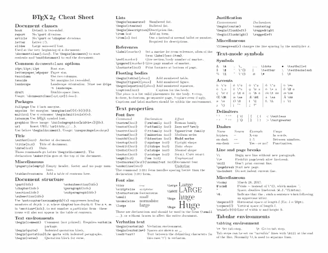
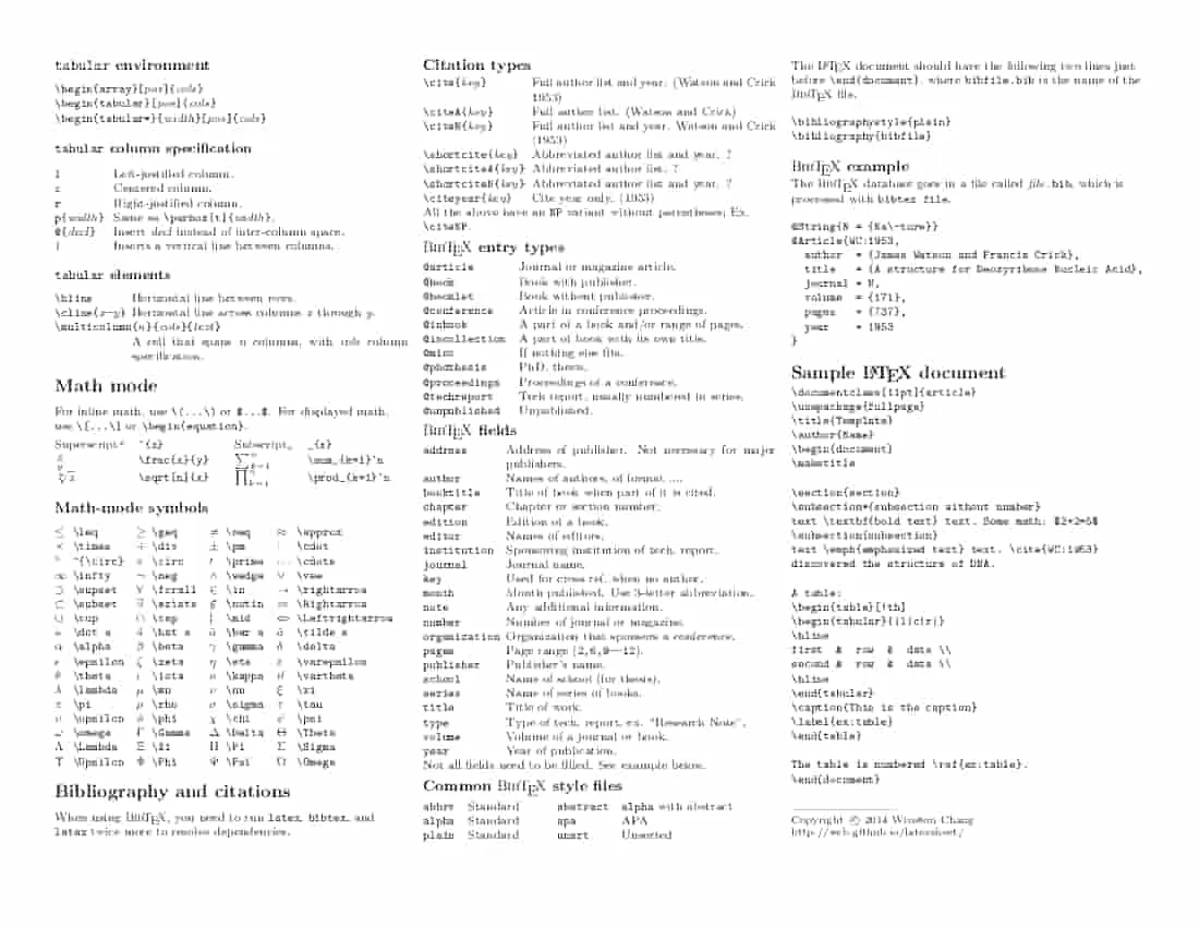
On that last point, I took a quick search on Github1 for any LaTeX cheatsheet templates that might be a suitable starting point for something more complex. And… yeah, while it might pass for a cheatsheet for Vim commands, it’s wholly inadequate for dealing with the sheer amount of content in your average university course, and is really a microcosm of the whole boilerplate and limited (practical) extensibility issues surrounding the use of LaTeX for making a cheatsheet. I mean, just look at that code 😔.
A decent-looking LaTeX cheatsheet, albeit one that isn’t necessarily the best use of space and is an absolute *pain* to edit in LaTeX.
\\
\section{Sample \LaTeX\ document}\begin{verbatim}\documentclass[11pt]{article}\usepackage{fullpage}\title{Template}\author{Name}\begin{document}\maketitle
\section{section}\subsection*{subsection without number}text \textbf{bold text} text. Some math: $2+2=5$\subsection{subsection}text \emph{emphasized text} text. \cite{WC:1953}discovered the structure of DNA.
A table:\begin{table}[!th]\begin{tabular}{|l|c|r|}\hlinefirst & row & data \\second & row & data \\\hline\end{tabular}\caption{This is the caption}\label{ex:table}\end{table}
The table is numbered \ref{ex:table}.\end{document}\end{verbatim}
\rule{0.3\linewidth}{0.25pt}\scriptsize
Copyright \copyright\ 2014 Winston Chang
\href{http://wch.github.io/latexsheet/}{http://wch.github.io/latexsheet/}
\end{multicols}\end{document}Typst (the ideal typesetting engine)
Typst is a new markup-based typesetting system that is designed to be as powerful as LaTeX while being much easier to learn and use (literally, just take a look at it’s GitHub: github.com/typst/typst). It’s so damn good that it absolutely deserves it’s own post, but for now we’ll leave that for another day. What’s important to note is that it’s so much easier to write virtually anything in Typst than in LaTeX, and it solves almost all of the pain points in the other tools mentioned above, including:
- Incremental compilation, which means that editing content updates in documents/previews instantly (rather than having wait between 1 and many seconds for LaTeX to compile, or for Google Docs/Microsoft Word to stop lagging).
- Easy extensibility: Typst has batteries-included functions for creating tables, drawing lines, setting colours for text and highlighted text (even gradient support is built-in), and so much more. Even the documentation for Typst is amazing, with examples to showcase how to use each of the different functions and how different arguments can affect the output (meanwhile, you pretty much have to learn how to use the intricate features of Google Docs/Microsoft Word by playing around with buttons, and I’m not even sure where you can get the core LaTeX documentation; latex-project.org/help/documentation is so complicated that it’s rather unhelpful, and the Overleaf docs at overleaf.com/learn are nice for beginners but woefully lack the complexity needed for more advanced documents).
- Similar to LaTeX, Typst supports importing third-party extensions and files built by other people (they’re even importable into your current document in the same way, using a single line with an
#import ...statement rather than\usepackage{...}).
- Similar to LaTeX, Typst supports importing third-party extensions and files built by other people (they’re even importable into your current document in the same way, using a single line with an
Another key characteristic of Typst is that you don’t need any complicated template with tens of lines of boilerplate code to start off writing your cheatsheet so that you have some modicum of structure to follow; you can just start of with something simple (e.g. a single table with a single row and column that fills the entire page) and then build on top of it (e.g. adding more rows and columns that are dynamically sized, with optional adjustments such that some rows/columns can be larger/smaller than others, such that the single table remains filling the entire page with no additional modifications required).
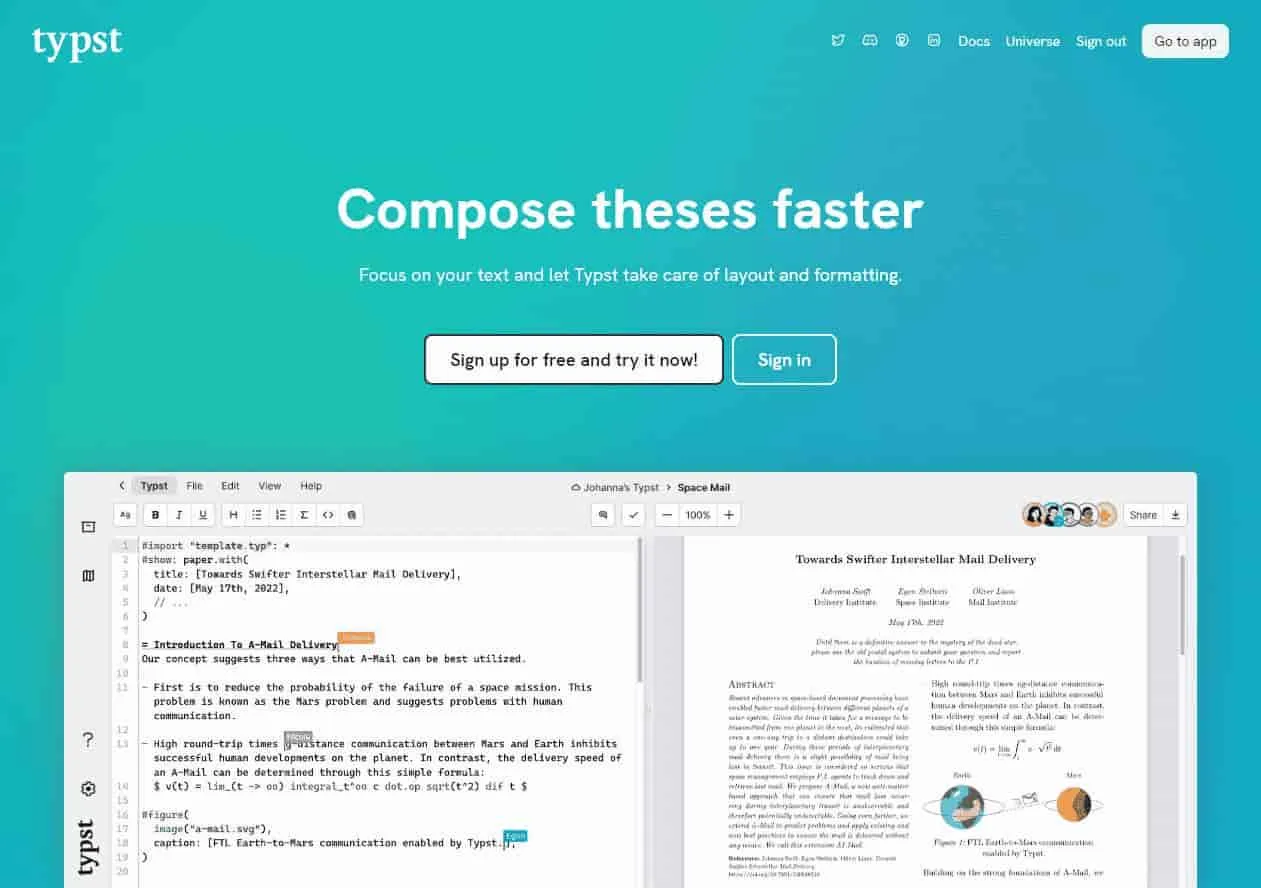
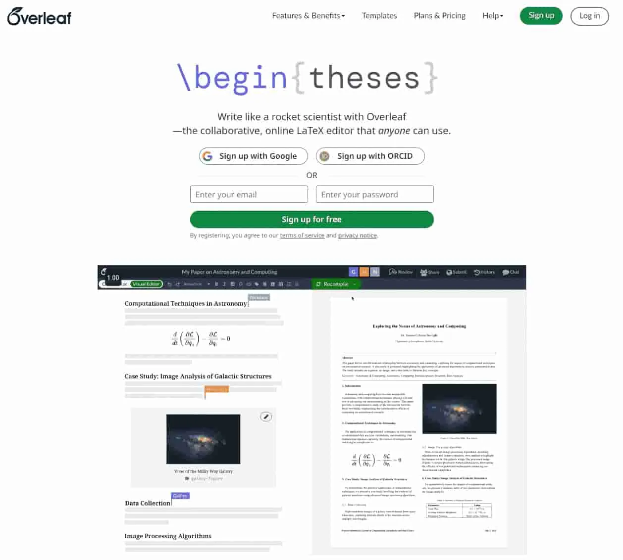
And what’s brilliant about all of this, is that the Typst team have been generous enough to build a fully functional web application (typst.app) to only store your Typst project files, but also edit them with dynamically updating previews and all sorts of bits and bobs to make your Typst writing experience oh-so-sweet (probably my favourite feature is the ability to not only click on some text or box in the output PDF preview and be immediately directed to the line of Typst markup that’s generating that specific output but also, with a line of code selected, jump and zoom in directly to the specific page and portion of the generated PDF that the markup is creating; remember this for later, because it comes in incredibly handy when you’re writing text at a size that’s on par with some smaller species of ants). typst.app is to Typst as overleaf.com is to LaTeX (except the Typst web app is so much better than Overleaf that the folks over at Overleaf actually copied their “new” landing page design to mimic Typst’s, which I’m not too surprised about given just how much better Typst is to use).
It’s awe-inspiring to think of just how powerful Typst is given how easy it is to use as well, making it a fantastic option not just for writing cheatsheets but for replacing LaTeX for a ridiculous number of purposes (as for myself, I now exclusively use Typst to typeset pretty much any PDF requiring math notation, which at the time of writing is pretty much just relegated to homework assignments for calculus/algorithms/data structures/database design courses). But we’re here to figure out how to write a kickass cheatsheet, so let’s get to it.
A reminder
Now, something that I’d like to point out before we dive into the meat of how exactly we can use Typst to make our denser-than-osmium cheatsheet is that this isn’t the only good way of writing a cheatsheet. By all means, you should use whatever you’re comfortable with to type it out, especially if your goal is to write something that’s good enough instead of something that’s incredibly dense (and may also might require a wee bit more squinting than some would prefer). What I’m investigating here is a way pushing the maximum readable word count in a typed-up cheatsheet to the very limit, which is why breaking down what makes one methodology or tool suboptimal for that purpose compared to another is so important.
The Message
Figuring out how to organize content on your cheatsheet.
So, here we are. We’ve got Typst down as our writing utencil of choice, and for the purposes of this scenario, let’s suppose we’re writing a cheatsheet for a computer security course (which is just as well, because I’ve got a raw text file just full to the brim of all the different concepts and terminology we’re going to want to put on our cheatsheet).
We’ve got our tool; now we have to figure out how to use it. And in order to do that, there’s a couple of important things we need to keep in mind.
How to Make Tiny Text Readable
1. Uniformity means readability
As someone who’s been writing cheatsheets over half a decade now, I’ve made this mistake far too many times in the name of trying to minimize how much white space I leave on my cheatsheets, and almost every time it makes them a complete mess and terribly difficult to parse (which as you can imagine is not ideal in an exam setting where you need to find very specific bits of information in a time constrained environment).
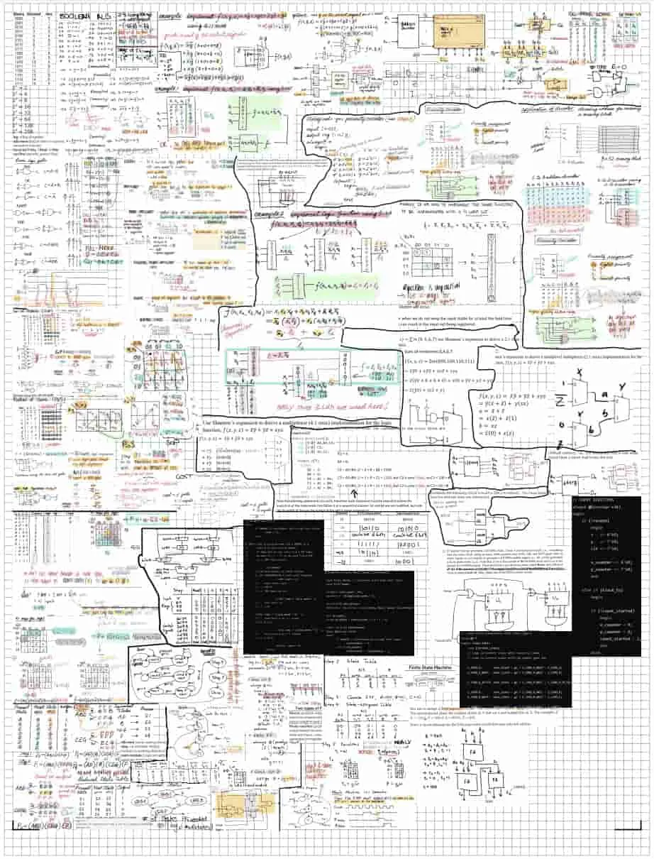
For a good example at what not to do, consider my cheatsheet for an introductory digital logics course from my second year of university. I can hardly distinguish the different groups of concepts amongst all the differently sized blocks of diagrams mixed in with text, and I was the one who wrote the entire darn thing, I can only imagine how you, dear reader, must feel looking at this spagetthi gobble of a cheatsheet.
It’s a prime example of what not to do when trying to make a cheatsheet that’s both dense and readable. But despite all that, it’s still what I walked into the exam with, and it was good enough that I got a decent grade on the exam (which really goes to show that all that matters is that you can read it, not that it’s the most readable thing in the world).
How do we maintain uniformity with incredibly tiny text? Well, for starters, stick with a consistent method of structuring your content. The best way of doing this, regardless of whether you’re using some typesetting engine or a text editor, is with a table. Ideally, a single table that fills up the entire page (so you don’t have to deal with all the spacing headaches trying to properly sandwich together multiple tables of different sizes onto the same 8.5x11 inch sheet of paper) with consistently sized rows and columns. In addition, go with justified or centre-aligned text instead of left/right-aligned (having straight edges for text boxes is a lot easier to read than text boxes with jagged edges that have no easily parseable pattern)
One thing to note: it’s ok to break uniformity and have something really stick out on your cheatsheet (if it’s really that important, or maybe if you ran out of time and just need to put something onto paper), just know that when nearly everything breaks uniformity, there isn’t really any uniformity to be had there (we just call that a mess).
And if you’re going to be using tables, there’s another important principle that I like to prescribe.
2. It’s easier to read up-down than left-right
Which means you should have small widths for columns, such that all you need to do is move your eyes straight down from a single horizontal position such that vertical-only movements enable you to parse through an entire column easily (trust me, this saves a lot of eye strain compared to having to read left to right and then down and back to start on the left every few lines).
3. Group related content together
- Highlight terms while leaving their definitions as plain text so that you can look into a sea of text and quickly see whether the term you’re looking for is even present at all first.
- Break up multi-layered content by using multiple levels of formatting for your headings, subheadings, definitions, sub-definitions, and so on.
- Also have separate fonts for important terms, plaintext, and special text (e.g. code, math); ensure that all work well at small scales (adjustments to character and word spacing can luckily be made by Typst, which means all you need to do is focus on readability; you can fit more characters of a thin font in the same space of whitespace compared to a wider font, so keep that in mind and maybe don’t select something as wide as Stint Ultra Expanded):

- Also have separate fonts for important terms, plaintext, and special text (e.g. code, math); ensure that all work well at small scales (adjustments to character and word spacing can luckily be made by Typst, which means all you need to do is focus on readability; you can fit more characters of a thin font in the same space of whitespace compared to a wider font, so keep that in mind and maybe don’t select something as wide as Stint Ultra Expanded):
- Have some method of clearly separating unrelated content (that minimizes use of whitespace, like a dotted line).
Other things to keep in mind
Convert JPGs to SVGs (which are better than PNGs since you can easily edit them to remove backgrounds or non-essential elements from slides so that you’re left with the most important details that remain readable at small sizes).
Implementing it in Typst
To see the whole project in action, take a look at typst.app/project/rbJ15a29M2OcglqKcAuWkM 2. But for an overview of how each individual part of the Typst project works together, continue on reading below.
📁cheatsheet/├── 📁fonts/├── 📁images/├── aidsheet.typ├── content.typ└── lazy.typcontent.typ and lazy.typ; the latter file is for when I got, as it is written, lazy and simply began copy-pasting text from lecture slides) and the content formatting specified within the aidsheet.typ file. First order of business before we get to the task of structuring our content: the page layout.
Programmability is one of Typst’s strong suits, and so it’s good practice to set variables for your cheatsheet’s document formatting properties (e.g. line spacing, image width, font size) because it can enable making minor document-wide changes down the road a whole lot easier. Of course, you’ll notice that I don’t do this all the time in my code below (and that’s largely because I wrote this cheatsheet under the time crunch of studying for 2 exams in 2 days, which meant that many a corner had to be cut to get it done).
...
#import "content.typ": *#import "lazy.typ": *
#set page( paper: "us-letter", margin: (
top: 0.2in, bottom: 0.1in, left: 0.2in, right: 0.2in ))
...'#let img_width = 70%#let font_size = 3.6pt#let line_spacing = 0.2em#let main_color = purple.lighten(20%).transparentize(20%)Add another couple hundred lines of formatting code (using alias for headers, bolded text, math, highlights, and more), along with a couple thousand lines of actual cheatsheet content, and you find yourself staring at what can only be described as a marvel of modern (text) engineering.
The Machine
Making sure readability and formatting are maintained on the journey from page to paper.
Black and white printers are better than color printers, because it’s a lot easier to find a BW printer with a high enough DPI for printing readable size 2-3pt text.
You’ll notice I don’t talk much about colour in this post, and this is exactly why. Yt’s pretty much ideal to go for super high contrast black-white text styles instead of greys bc a lot of BW printers actually just reduce the number of dots printed using the small ultra black ink to make gray show up on paper (which as you can imagine is not ideal for maximizing the resolution of text and images at a small scale; this has burned me in the past a couple of times, and I have learnt to stay away from it ever since)
I’ve also found that a DPI of 1200 is the sweet spot for getting really high quality prints out; while a smaller DPI could technically remain readable, I’d recommend going up in font size by a half point or two just to make your cheatsheet a bit easier to read (if you have to use a magnifying glass to read content, then you’re not exactly making things easier for yourself, which is the entire point behind this whole compressing a textbook into a single sheet of paper).
The Result
What it looks like all put together.
Is it readable in real life? Quite so.
In fact, you know what I kept thinking during the exam that I used this cheatsheet in?
…I think I could’ve gone with a smaller font.
Footnotes
-
Searched for LaTeX cheatsheet templates at github.com/search?q=cheat+sheet+template&type=repositories ↩
-
Note that there are some minute differences between the code linked here and the overview below for clarity purposes. ↩
